A mobile gambling app design system defines reusable components, shared design decisions and change rules. It gives designers and engineers shared foundations for account screens and support experiences across iOS and Android.
The practical starting point: define semantic design tokens, document a small component registry, specify meaningful states, map components to platform code and require evidence before changes reach production. A Figma library alone is not a design system; the source files, implementations, owners and release process must stay aligned.
This guide focuses on team-level UI foundations. Detailed player-protection behavior, regulatory interpretation and formal accessibility acceptance belong in separate product specifications. Examples below are illustrative and must be reviewed for the actual product and market.
Why a Shared Design System Matters
Without shared conventions, the same alert can look different in account settings, identity checks and support screens. One team may use a warning color for an unavailable service; another uses it for an error. Labels diverge, spacing drifts and test cases must be rewritten for near-identical components.
A system makes four things inspectable:
- Visual decisions: which color, spacing, type and shape values are approved.
- Interaction patterns: which component variants and states exist, including failures and loading.
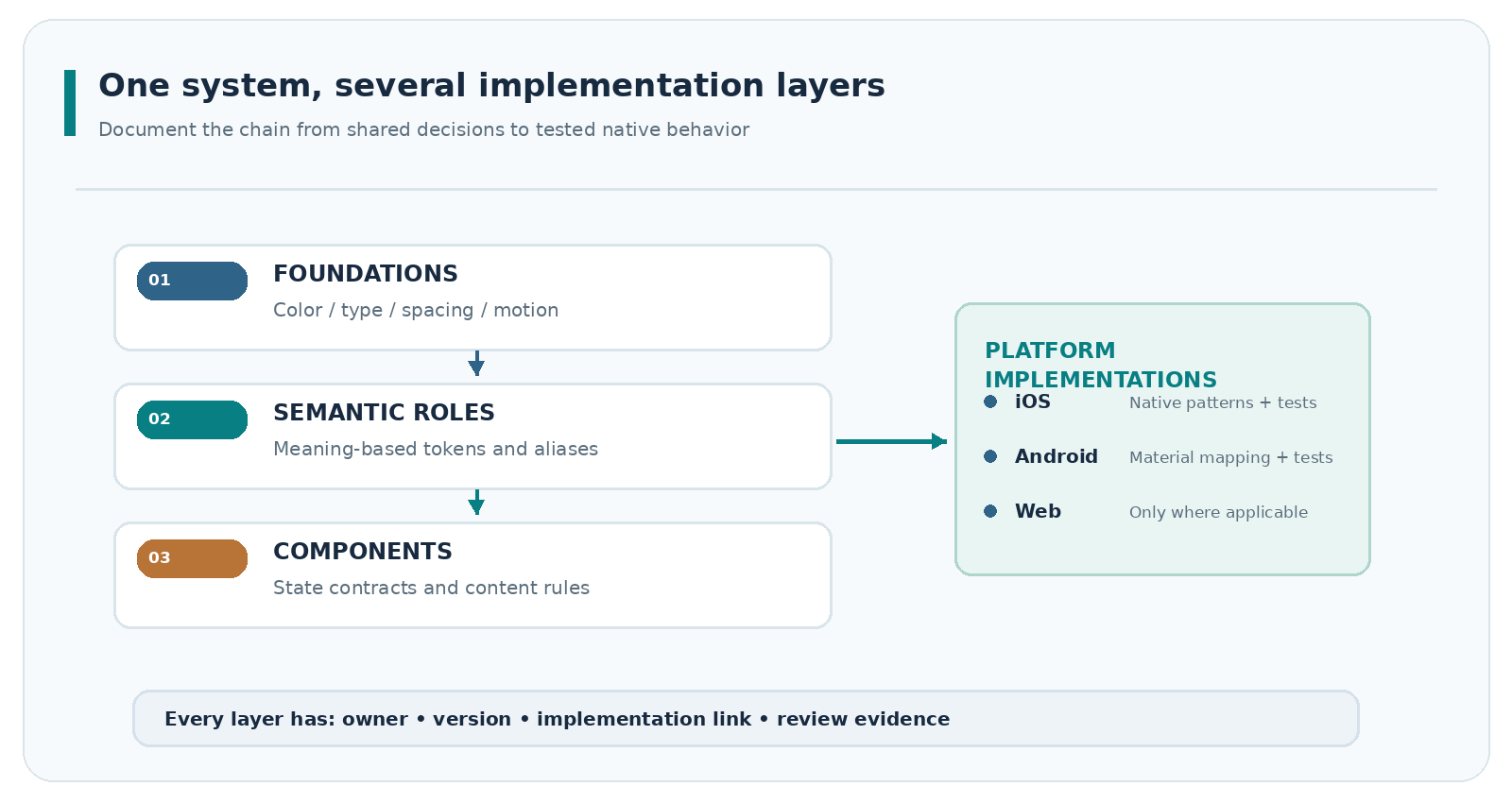
- Implementation contracts: how those decisions map to native iOS, Android and any web surface.
- Change ownership: who approves, versions, tests and retires a component.
Changing an account-status banner should not silently alter a support warning elsewhere. Semantic tokens and component contracts reveal the shared dependency.
Decide what belongs in the library
Start with components used by more than one journey: buttons, fields, selection controls, navigation, inline alerts, dialogs, progress indicators, empty states and support links. Keep specialized gambling logic out of generic components. A common dialog can provide consistent structure, but its eligibility rules or account-restriction copy require separate domain ownership.
Choose a limited foundation, assign component owners and record exceptions.
Design Token Taxonomy: From Values to Meaning
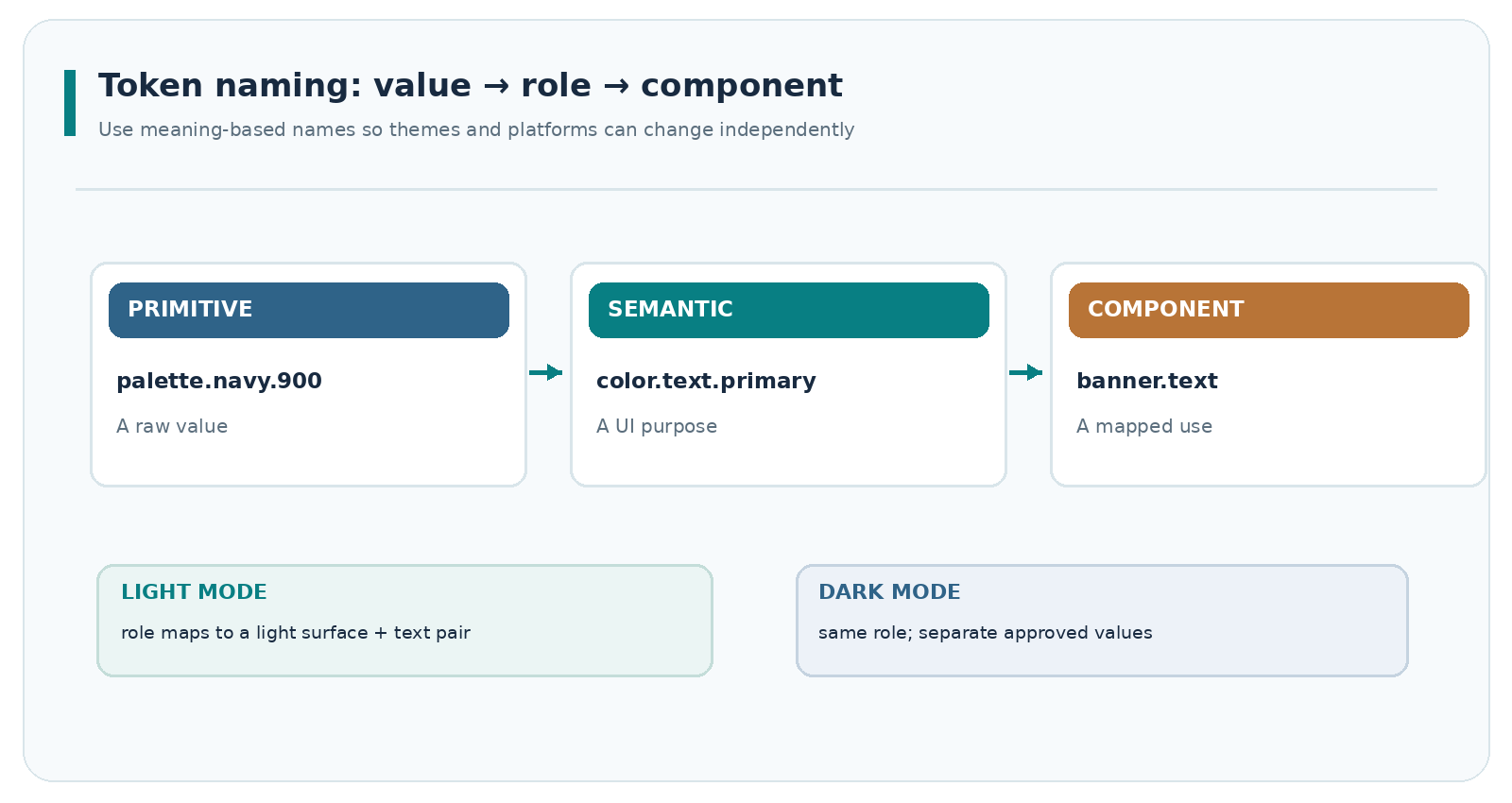
A token gives a name and type to a design decision. A raw palette color such as palette.blue.700 describes a value. A semantic token such as color.text.primary describes a role. Components reference roles so themes can change without introducing color literals throughout the product.
The Design Tokens Community Group Format 2025.10 defines a stable, vendor-neutral JSON exchange format using properties such as $type and $value. It is a W3C Community Group specification, not a W3C Recommendation or Standards Track standard. Test exports before assuming cross-tool compatibility.
| Token layer | Example name | Purpose | Common failure |
|---|---|---|---|
| Primitive | palette.navy.900 |
Stores a raw color value | Directly reused for unrelated meanings |
| Semantic | color.text.primary |
Expresses an approved text role | Named after a color instead of a purpose |
| Component | button.secondary.background |
Maps a role to a particular component | Overridden differently in each product squad |
| Scale | space.4, radius.md |
Defines spacing and shape increments | Arbitrary one-off values added without review |
| Mode | Light/dark role mapping | Changes role values for a theme | Only default-mode contrast is checked |
Use a consistent naming convention that avoids device-specific assumptions. A practical pattern is category.role.variant.state for semantic and component tokens, with deliberately few levels. Reserve platform-specific names for generated outputs or documented exceptions.
A small, testable token source
The included example-design-tokens.tokens.json demonstrates colors, spacing, typography-related dimensions and token aliases in the 2025.10 exchange format. Values are illustrative, not a tested accessible theme or an approved brand palette.
Review token resolution, typed exports, dark-mode mappings and diffs. A token file is useful only if designers and build pipelines are working from an agreed version. Document platform-specific mappings; a JSON file does not compile directly into every framework.
Build a Component Registry, Not a Screenshot Gallery
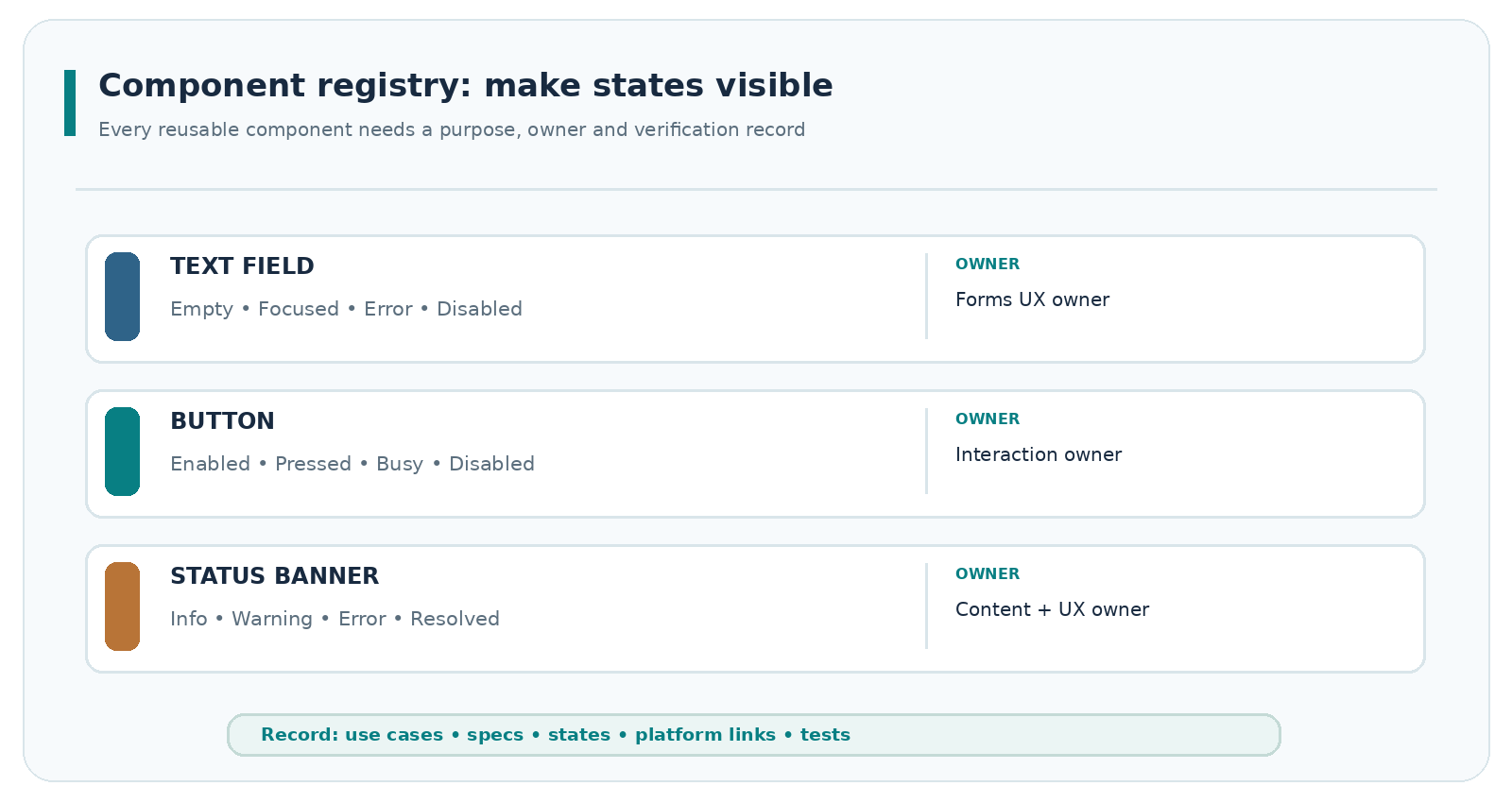
A component registry records the contract behind a reusable pattern: purpose, permitted variants, states, owner, supported platforms and evidence. Screenshots cannot replace interaction descriptions or acceptance records.
Start with a concise inventory:
| Component | Required documented states | Ownership question | Evidence to retain |
|---|---|---|---|
| Text field | Empty, focus, valid, error, disabled, loading where applicable | Who owns labels and error content? | Spec link; iOS/Android tests |
| Action button | Enabled, pressed, focus, busy, disabled | Can actions be triggered twice? | State and interaction tests |
| Status banner | Information, warning, error, resolved | What triggers each status? | Content review and announcements |
| Account settings row | Default, selected, unavailable | Is the destination and label stable? | Navigation and screen-reader review |
| Confirmation dialog | Open, pending, completed, failure | Who approves confirmation wording? | Decision and failure-path tests |
The downloadable component-registry.csv includes suggested fields for repository links, design links, platforms, version, review status and deprecation date. Treat it as an example governance record, not proof that a component has passed any audit.
Specify behaviors before variants multiply
For every component, document: anatomy, properties, defaults, valid combinations, interaction states, focus order, content guidance, responsive behavior and known exclusions. Distinguish a disabled action from a busy action: the first is unavailable for a stated reason; the second is processing and should not accept accidental repeats.
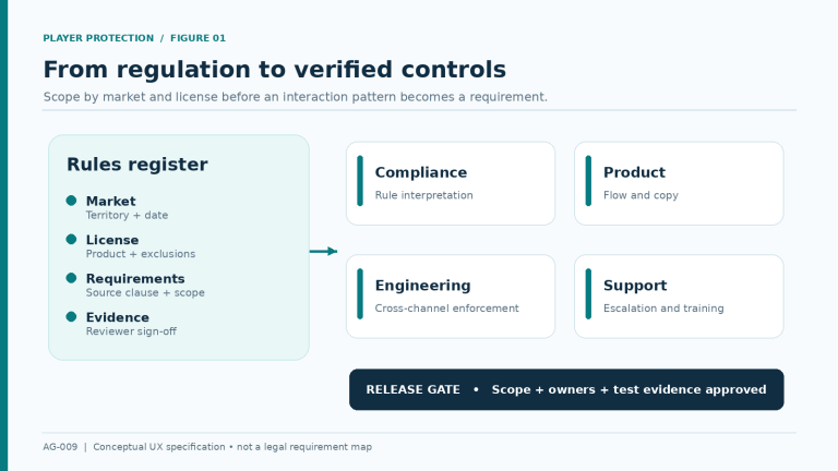
Include positive and failure paths. A verification-status message, for example, may need a pending state, a non-sensitive explanation and a route to support. The shared banner governs layout and announcement behavior; compliance and product teams own the underlying eligibility decision.
Govern Content, Motion and Reuse Boundaries
Design systems also control small pieces of language: field labels, status conventions, button verbs, date and currency display patterns and error-message structure. Store copy rules near components, but keep jurisdiction-specific content in an approved content source.
Useful content rules include:
- Name the action plainly: use “Save changes” rather than a vague “Continue” when that is the actual result.
- Explain recoverable errors without exposing sensitive account or identity information.
- Reserve colors and icons for stable meanings; never rely on color alone to distinguish a status.
- Specify how longer translations wrap, truncate or change layout without hiding essential information.
- Provide a clear place for help links in relevant states rather than burying them in decorative content.
Motion requires the same discipline. Define transition purpose, duration and reduced-motion behavior. Avoid motion that makes account status harder to interpret or presents urgency as a substitute for clear information. For the applicable accessibility framework, review motion and contrast requirements separately rather than assuming a token library creates compliance automatically.
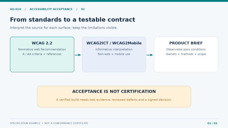
The W3C’s WCAG 2.2 is a normative web accessibility standard. Its WCAG2Mobile guidance explains how criteria may apply to mobile applications, but the referenced document is an informative Group Draft Note, not a mobile-app conformance certificate. Product-specific accessibility criteria, testing methods and sign-off belong in the accessibility acceptance brief.
Component evidence does not establish accessibility of every assembled screen. For product-specific safeguards such as account limits and exclusion controls, see the separate responsible gambling UX requirements specification.
Map the Library to iOS, Android and Web
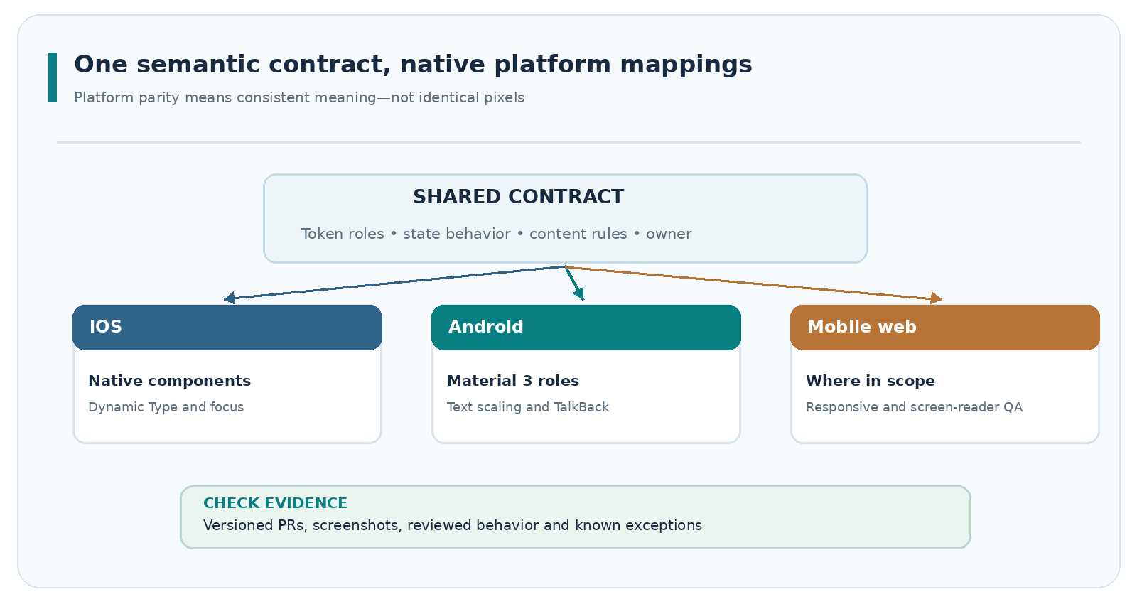
A cross-platform design system needs shared intent and native implementation rules. Identical pixels are not the goal. A control should communicate the same status and outcome while respecting each platform’s navigation, text scaling, focus and system conventions.
Apple’s Human Interface Guidelines describe platform-specific components and foundations. Android’s Material 3 theming documentation describes color schemes, typography and shapes used by Compose components. Apply each platform’s conventions rather than forcing identical patterns.
| Shared contract | iOS implementation review | Android implementation review | Evidence |
|---|---|---|---|
| Semantic text/surface roles | Map to supported appearance and system colors | Map to Material theme roles or documented custom roles | Token diff and contrast review |
| Text scale and wrapping | Dynamic Type and layout behavior | Font scaling and Compose text behavior | Device screenshots and checks |
| Dialog semantics | Native dialog conventions and assistive labels | Material dialog behavior and semantics | Interaction test record |
| State announcements | Assistive technology review | TalkBack and focus behavior review | Reviewed test steps and defects |
| Navigation pattern | iOS navigation conventions | Android navigation and back behavior | Platform handoff sign-off |
Set a minimum handoff package
A handoff should contain one canonical spec URL, a component version, token dependencies, screenshots for key states, content rules, a linked code implementation, test expectations and a named decision owner. Document gaps instead of claiming false parity.
The included handoff-checklist.csv can be adapted for native, hybrid or mobile-web builds. Localization production and language-specific QA remain part of the separate mobile gambling localization workflow; a component library should only document its layout and content constraints.
Versioning, Change Control and Component Acceptance
An unowned library becomes a collection of competing patterns. Assign a design-system maintainer, engineering representatives for each platform, and reviewers for content and accessibility. A named domain owner joins when a change affects regulated functionality or critical account information.
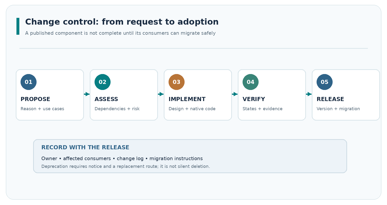
Use change requests with a reason, affected tokens and components, linked product use cases, migration plan and acceptance evidence. A practical sequence is propose → assess impact → implement → verify → version and communicate. When a shared token changes, identify every dependent component before approval.
Define breaking changes and release criteria
A breaking change is one that requires consumers to modify code, component properties, behavior or content to preserve existing results. A purely visual adjustment may still be breaking if it changes essential status meaning or accessible interaction. Keep a changelog with the affected components, platform versions, migration instructions and fallback plan.
Before marking a component approved, require evidence that:
- Its use and exclusions are documented, with no unresolved owner.
- The default, error, loading, disabled and relevant focus states are specified.
- The design source, token version and platform implementations are linked.
- Content and accessibility reviewers have signed off on the criteria in scope.
- Automated or manual checks are linked, including failure cases.
- Any migration or deprecation notice reaches consuming teams.
The included change-request-template.md records these decisions. For governance, distinguish draft, in review, approved, deprecated and retired; never reuse “approved” to imply legal or accessibility certification.
Start with foundations, frequently reused components, one implementation reference per platform and a recurring review of exceptions. Expand as ownership and adoption become sustainable.
Frequently Asked Questions
What belongs in a mobile gambling app design system?
Reusable tokens, components, states, content conventions, cross-platform mappings and a versioned review process. It should reference—but not replace—product-specific player-protection rules, regulatory decisions or accessibility acceptance specifications.
Should iOS and Android share the same component library?
They should share semantic decisions, names, ownership and intended outcomes. Native controls and platform behavior may differ. Document mappings and deviations instead of promising pixel-for-pixel parity.
Are design tokens enough to meet WCAG requirements?
No. Tokens can help standardize contrast and spacing decisions, but accessibility depends on component behavior, screen composition, assistive-technology support, content and testing. Do not publish an accessibility claim based on a sample token file.
How should design-system changes be versioned?
Publish versions with an impact statement. Flag breaking changes, name affected consumers, provide migration instructions and retain the test evidence. A changelog without an adoption path does not prevent drift.
Which components should the team build first?
Choose patterns that repeat across real journeys: forms, buttons, alerts, settings rows and dialogs. Prioritize components with frequent inconsistencies or unclear ownership, then add specialized patterns only when their reuse is demonstrated.
Official References
- Design Tokens Community Group Format Module 2025.10 — stable community specification, not a W3C standard.
- Apple Human Interface Guidelines — iOS platform patterns and design foundations.
- Android Material 3 theming — Compose theme roles and components.
- WCAG 2.2 and WCAG2Mobile Group Draft Note — distinguish normative web criteria from informative mobile guidance.
Source review: November 3, 2026. This is an implementation and governance guide, not a claim of regulatory or accessibility compliance. Validate keyword demand, market assumptions and internal target URLs before publication.